
Every iconic business around the world has a logo that everyone can recognize. Such companies take great pride in their logos, and they go to great lengths to protect the logos.
Below is a list of some of the most recognizable business signs around the globe.
- Coca-Cola
In 1886, Dr. John S. Pemberton created a drink that would eventually become the most iconic soft drink in the world. However, he left it to his bookkeeper, Frank Robinson, to come up with the name Coca-Cola.
The unique Spencerian script used to make the logo has remained since the first time Robinson carved the logo. The Coca-Cola drink and the logo’s uniqueness make it unforgettable.
- Apple
The apple logo on every Apple device has been the subject of many theories and possible explanations as to its potential meaning. Apples have for a long time been in the center of myths such as the fall of man in the Garden of Eden and Snow White.
However, its allure is in its simplicity. The designer, Rob Janoff, explained that the iconic bite was only added to make sure that people didn’t confuse it with a cherry.
Google made its first logo in 1997. Since that time, the main changes to the logo have been the font. The company has maintained its use of colors since it launched the logo.
The colors on the logo speak volumes about Google. They give Google a fun and happy vibe that keeps drawing people back to the world-famous search engine.
- Nike
When Carolyn Davidson presented Phil Knight with the Nike logo, hedidn’t like it. Nevertheless, he paid Carolyn $35 for her work, and he went on to use the logo.
The Nike ‘Swoosh’ is now one of the most recognizable logos in the world. It draws people because of its simplicity and the products that it represents.
- McDonald’s
The famous yellow arches synonymous with McDonald’s came in 1952, but they became part of the official logo in 1961. McDonald’s has since become a global leader in fast foods.
The McDonald’s logo is famous because of its unique colors and what it represents. The sign represents a universal love for fries and burgers.
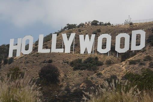
- Hollywood
The iconic Hollywood sign has faced a turbulent past, and we probably wouldn’t have it today. In the late 1940s, the council of Los Angeles dubbed the sign a public nuisance, and it resolved to demolish it. However, it was restored in the 1970s, thanks to a committee led by Hugh Hefner.
The Hollywood sign is iconic because of what it represents. The sign represents the fame and fortune enjoyed by the residents of Hollywood.
- Starbucks
The original inspiration for the Starbucks logo was a mermaid. The mermaid was unique since it had a double tail. The logo has changed a lot since its initial design, but the mermaid remains. Howard Schultz made changes to the logo to make it more competitive in the corporate world.
The logo symbolizes how Starbucks has made coffee unique. The symbol’s uniqueness and symbolism make it impossible to forget.
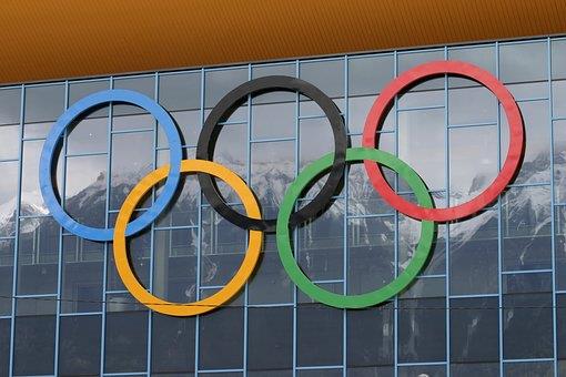
- Olympic rings
The Olympic rings are the universal symbol of the Olympic Games, and they represent so much more. The logo consists of 5 rings, each symbolizing one continent. In addition, the colors on the rings represent the colors that appear frequently on national flags.
The Olympics logo is iconic because it represents togetherness and equality. It is a universal symbol of peace and unity.
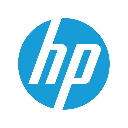
- Hewlett-Packard (HP)
The name Hewlett Packard came fromthe names of the founders. Dave Packard and Bill Hewlett agreed on the order of names via a coin toss. HP has since become one of the leading computer manufacturers in the world.
The logo has developed over the years, but it still retains the slanting ‘h’ and ‘p’ letters from the original logo. HP has developed a knack for always being ahead of the game. The logo represents the company’s infinite innovation.
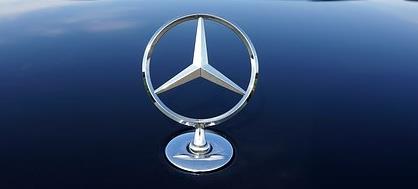
- Mercedes-Benz
The iconic Mercedes-Benz logo appeared in 1926 when DMG and Benz merged to form Daimler-Benz AG. The company later renamed officially to Mercedes-Benz, but the three-pointed star logo remained. The three-pointed star represented Benz’s desire to dominate the globe.
At the moment, the three-pointed star represents unrivaled quality and excellence in the motor industry. It has made Mercedes the go-to car for anyone looking for uncompromising quality.
If you are designing a logo for your business, it’s worth noticing the simplicity of the signs that have stood the test of time. Simplistic shapes and minimal colors have been used to create something that would be eye catching and memorable on a multitude of mediums. From neon business signs, to posters, consumables and memorabilia.
The simplicity allows the logo to be easily transferable and created in a manner that will always appeal to, or catch the attention of the audience.
These logo’s are true iconic international symbols that could be recognized in most countries around the world. What more could you want from a logo?