
Selecting wall art to your space is not always an easy task, especially if your existing design is not cohesive. However, it is super important to invest some time and effort in finding the ideal artwork for your space. Why? Because it creates a focal point and visual interest, and it’s also a meaningful way to show your personality. When done right – it can tie together all other elements and patterns in your space.
There are many aspects to consider when decorating a room, and one of the most important aspects is your color palette. Colors tend to influence the way we feel, and truly set the tone for the entire space. There is more than one approach to color in interior design, as your decor can be monochromatic, harmonious or bold. Before selecting your wall art, It’s a good idea to consider the existing colors and the vibe you want to create in the space.
Don’t know where to start? Don’t worry, we’ve got you covered! We’ve gathered all the best tips to help you choose the right wall art for your colors!
- Define your color palette.
First, it’s important to determine what the dominant color in your interior is. To balance the colors while also allowing some visual interest, start with the basic rule of 60-30-10. That is, divide your interior into 60% of a dominant color that is also used as your backdrop. 30% of a secondary color that supports your main color, and 10% of an accent color. Of course, rules are meant to be broken, but this ratio will help you easily maintain a balanced color scheme in any space. According to this rule, the color of your wall art should be one that already exists in your room. - Match large artwork with your dominant color.
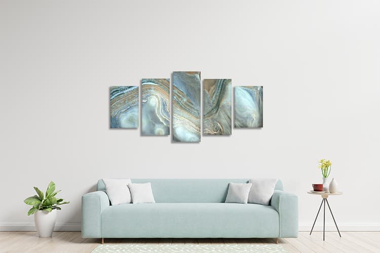
Now that you know what your dominant color is, use different shades of it in your large piece of art. You’d be able to create a cohesive look if you match your artwork to a colorful rug, upholstery, or even a bold-colored wall. - Add contrast to a neutral space.
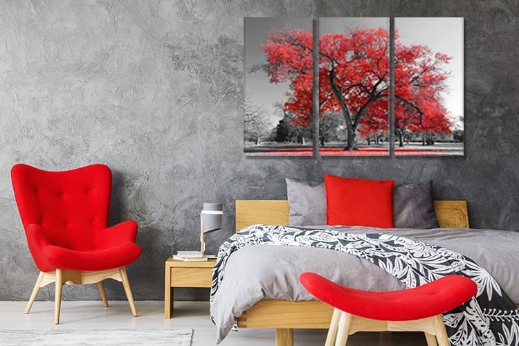
Neutral colors in decor are on trend! If you just love your beige, gray, and cream tones, this tip is for you. Add a bit of interest without affecting the restful feel of those shades! How? Try using a bit of contrast by mixing cool and warm neutral shades. For instance, let’s say your interior includes mainly cooler undertones of gray and white. Try matching a canvas print in warmer shades like yellowish-ivory or taupe. The result would be beautiful! - Get a little help from the color wheel.
Another way to create visual harmony is to use analogous color schemes. Meaning – matching colors that are next to each other on the color wheel. These adjacent colors work well together and are very pleasant to the eye. If the dominant color in your interior is blue, a purple artwork would be complementary and create a harmonious design. - Create harmony with a monochromatic look.
By using a monochromatic color scheme, you can put an end to your concerns about matching colors! Choose one color that uplifts your mood, then incorporate its different tones in your decor. It will create visual harmony and a pleasant, consistent look. Your wall art can match that color, or can even introduce a bolder shade of that color. Alternatively, you can balance your decor with a wall art in neutral shades that will really stand out. - Match the background to the wall.
In order to avoid color clashes, make sure that the background color of a large and significant wall art matches the color of your walls. It could be different shades of the same color, it could be complementary colors, or if your wall really stands out, the next tip is for you. - If nothing matches, go with the basics.
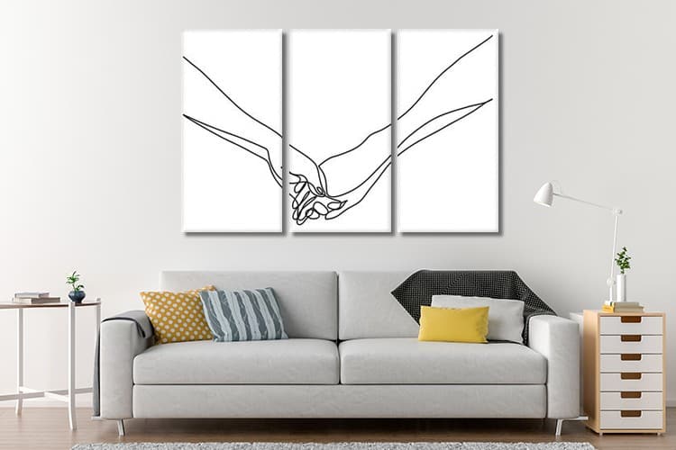
If your space is already loaded with colors, trying to add a colorful artwork can be a little overwhelming (or sometimes, a total disaster). In that case, simply go with a basic black and white wall art. This classic combination always works, and it adds some elegance to your space. So no matter how many colors you already used in your space, classic black and white are sure to complement it!
Of course, there are many different approaches to style and decor. However, there are no rules that fit everyone and every space. Keep in mind that in the end, decorating should be fun and you should feel comfortable and happy in your own space. So go ahead and try those tips, but remember to play with it, try different combination to see what works for you. Because eventually, it’s all about you and your own personal preferences. Use colors to express yourself and communicate the ideas that matter to you!